How to write the best UX copy and notifications for iOS and Android

If you’re a Harry Potter fan, you already know that some words are vastly more powerful than others. You’d never use a charm like “Lumos” (for light) to win a duel. You’d reach for “Stupefy” (stun) or even Expelliarmus (disarm) when the stakes are at their highest.
Choosing the right words for your UX copy and mobile messages is no different.
The app market is so competitive that the 30-day churn rate in the app stores now sits at a daunting 94.3%. With so little time to grab attention and show value, every word on every screen can make the difference between a lifelong fan or a quick uninstall.
This is where “power words” come in. They’re the battle-tested most-effective words you can use in your mobile app messaging.
Read on to learn how to create your best UX copy for iOS and Android using “power words” that reliably increase app engagement from onboarding to loyalty.
14 proven strategies to boost your app engagement
Using “power words” for the best UX copy
So, what are “power words?”
Power words evoke an emotional response in your audience to hold their attention and drive action. They make UX copy compelling. Clearer. More engaging. And despite being just a few syllables, they can make a massive difference in your app’s success from day one.
Professional copywriters—the people who capture attention for a living—have known for decades that certain words punch above their weight. From viral YouTube videos to email marketing to mobile app advertising, power words show up everywhere because they work.
Power words play on the deep psychology of the human brain. They work because they tap into our feelings related to fear, ego, greed, safety, even taboos. They can make your audience feel special, trusting, and excited about using your app.
In short, using the right words in your product and messaging copy can reliably increase user engagement, conversions, and loyalty by making your UX copy and notifications stand out from the crowd.
150 power words for the best UX copy
To determine the most powerful words for your app messaging, I collated analysis on 2.6 billion app messages from Hubspot, the Mobile App Marketing Trends Report, and our own Sendbird data.
All these words are action-oriented and user-centered, designed to make your mobile app messaging clear, concise, and encourage engagement.
Some are bold and captivating, others are essential to concisely communicating what to do in a UI where space is at a premium.
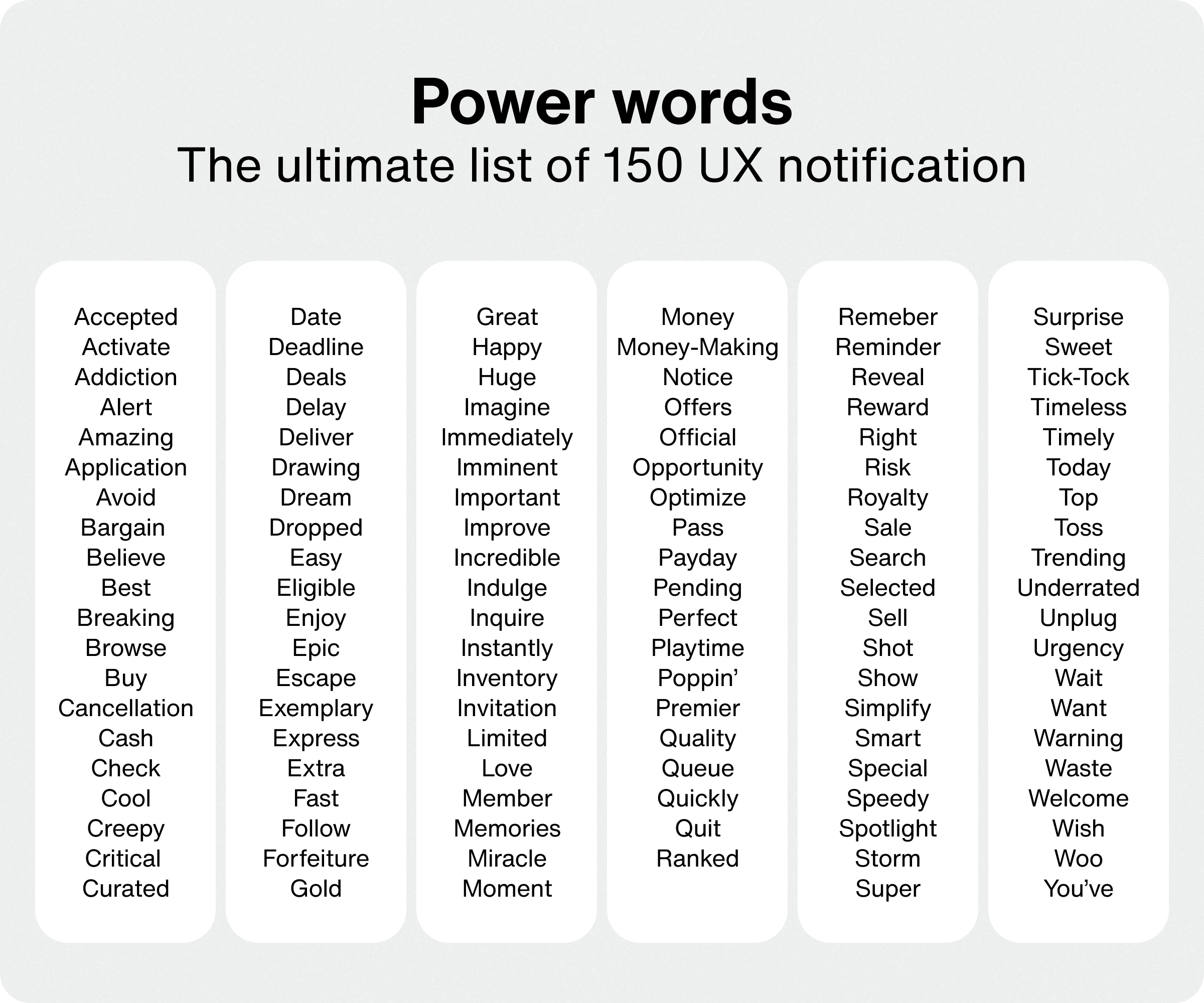
Now that you’ve seen the big list, you might be wondering—when exactly should you use each of these words in your UX copy, in-app messages, push notifications, and microcopy?
How to write the best UX copy across the app lifecycle
Even though power words can have a big impact on your user onboarding, engagement, and conversions—it’s important to use them in the right context. Below, I outline how to use power words in every key stage of your user experience:
Onboarding
Engagement
Re-engagement
Conversion
Loyalty
1. The best UX copy for onboarding
Words like “unlock” or “discover” or “explore” draw users in, making them feel they’re about to gain something valuable or unique, while creating anticipation and curiosity. For example, a fitness app could prompt users to “Discover the perfect fitness routine just for you.”
Here are more power words that communicate value:
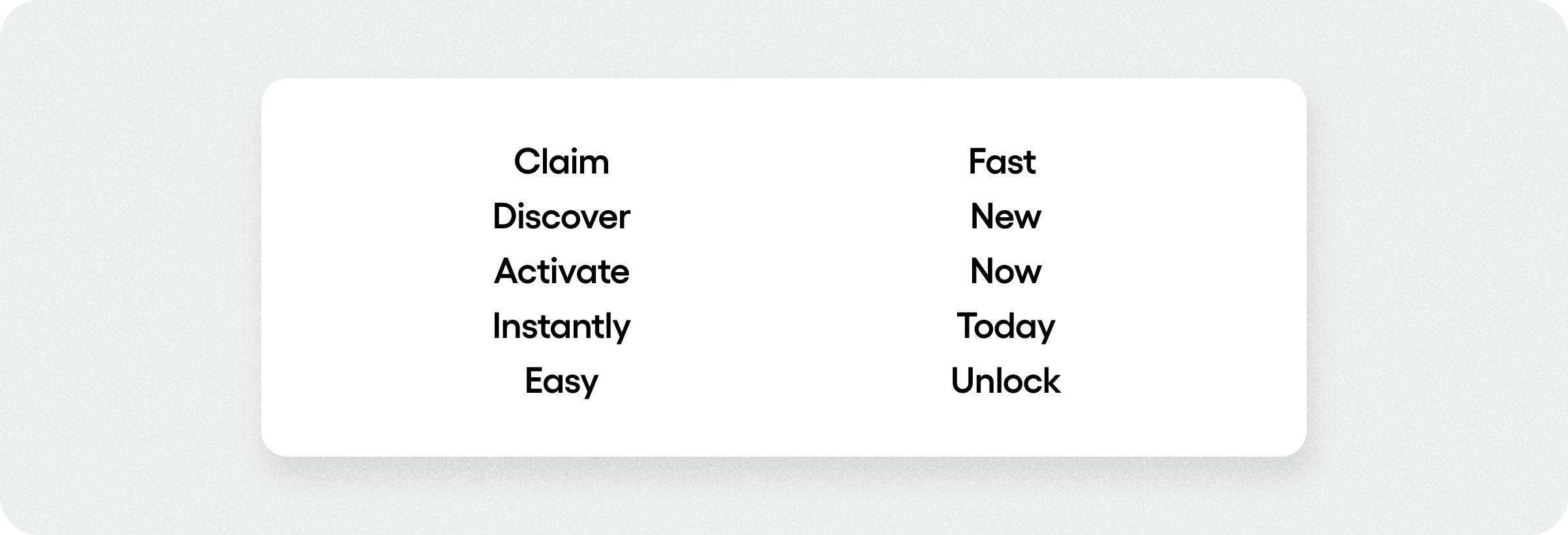
Using benefit-driven language in your introductory screens and navigation will create excitement for functionality, while diminishing the perceived effort needed to get to value.
Onboarding is a delicate stage where users are still deciding if they want to invest in the app, so asking them to create a profile or login can be a big hurdle. You may want to postpone asking for personal details until after users get to value.
Etsy does a good job of helping users see the value of account creation with value-driven language like “save your favorites" and “personalized recommendations” that allude to unique value to come.
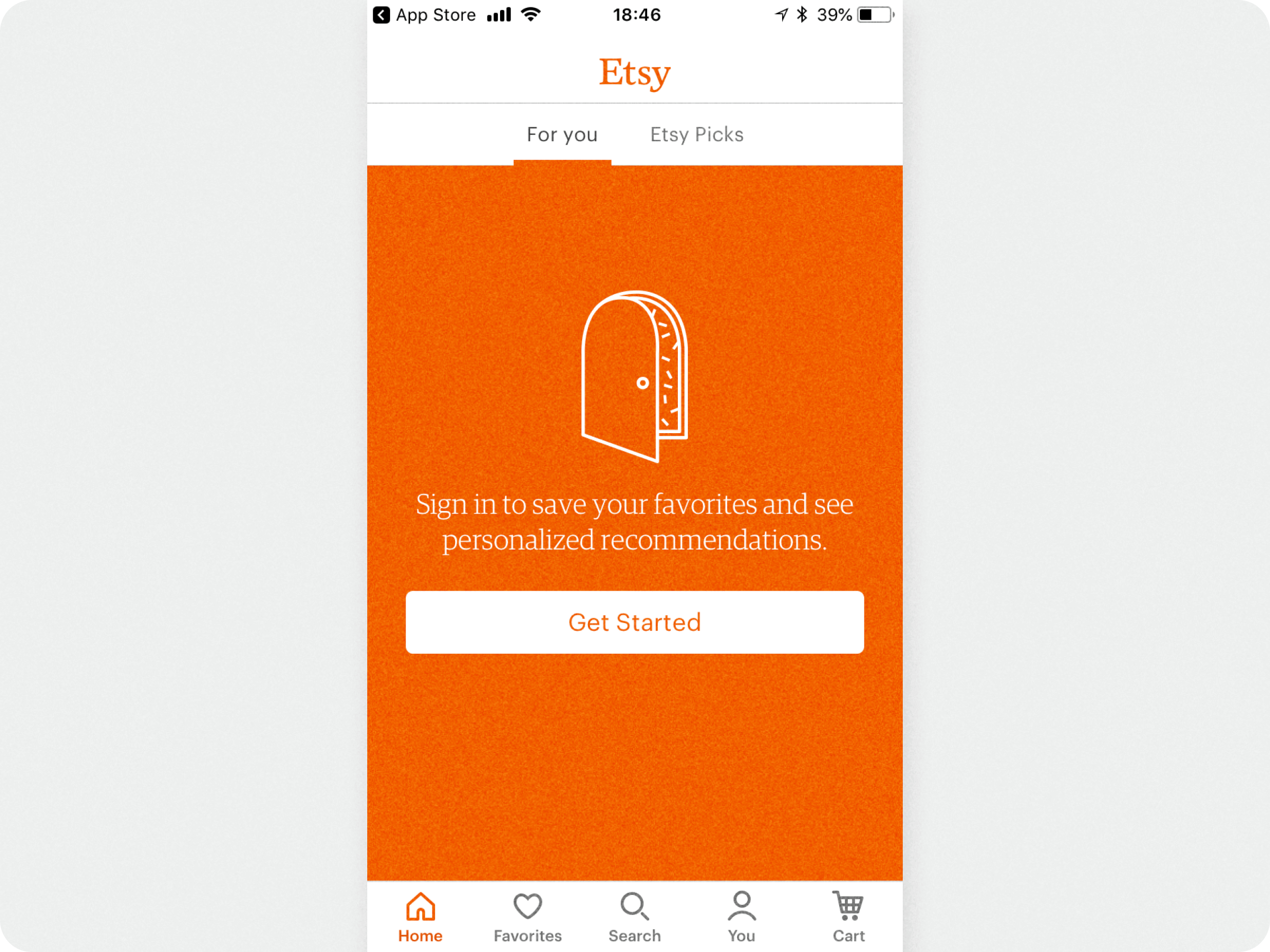
Onboarding should feel like a choice instead of a chore, so use your UX copy to keep the vibe upbeat and value-focused.
2. The best UX copy for engagement
After onboarding, you can deepen engagement with UX copy that makes interactions feel personalized, memorable, and motivating. This will drive discovery of features and content, while helping to build habits that lead to retention and loyalty.
Make users feel special with personal language
Personalized language is key to engagement. Personalized app content outperforms generic content by far, and 37% of consumers say they only engage with in-app messaging that’s personalized.
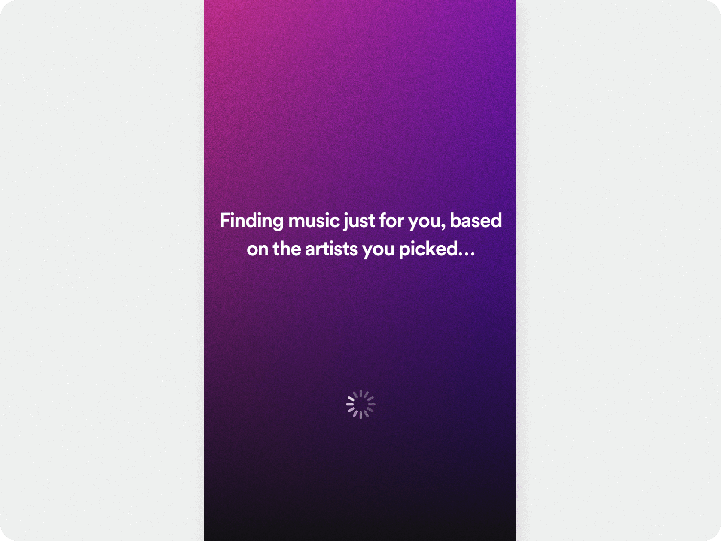
Words like “just for you,” “curated,” and “hand-picked” shows users your app aligns with their interests and is actively tailoring the UX to them, encouraging them to return regularly.
For example, a dynamic home screen or content updates could say: “Here’s more personalized content just for you!” to sustain interest.
Boost motivation
Motivational words like “reward,” “level up,” and “achieve” help inspire users to take the next step, complete actions, or reach goals in your app. They’re commonly used with gamification elements like challenges or competitions, or education and fitness apps that hinge on you to complete tasks or reach new milestones.
For instance, an education app could use in-app messages or push notifications to entice users to “Level up your skills with new challenges” to encourage engagement.
- Achieve
- Challenge
- Level up
- Prize
- Ranked
- Rare
- Reward
Note: In-app notifications can help keep users engaged and consistent. By guiding users to explore features, join challenges, or read new content, they help you shorten the time to that aha! moment.
14 proven strategies to boost your app engagement
3. The best UX copy for re-engagement
If you want to communicate with inactive users to bring them back to the app, you must first persuade them to opt-in to push notifications.
Push notifications are an effective way to re-engage users because they appear on the mobile device's home screen. You can send limited-time incentives such as discounts, free upgrades, or progress reminders.
However, only 40% of iOS users opt-in to push notifications. What’s more, if you display the default iOS prompt when users first open the app, you won’t get many takers because it doesn’t promise any value.
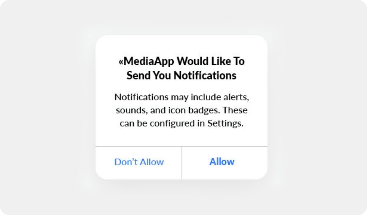
Instead, you can explain the value of push notifications and their role in creating a timely and personal experience with a custom in-app notification. Airbnb does this well:
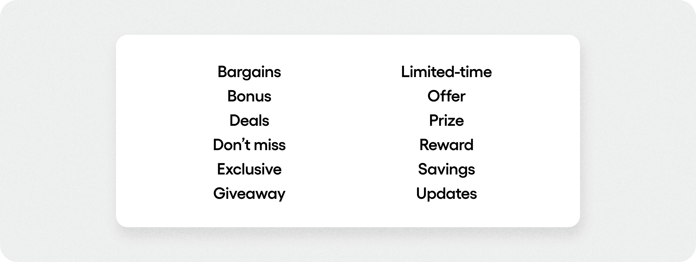
Users will also be more likely to sign up if you're offering exclusive content or promotions. For example: “Don’t want to miss out on the latest news and our monthly giveaways? Sign up for notifications.”
Once users have opted in, the push notifications copy should make it clear what’s on offer, such as exclusive promotions or time-sensitive discounts. Value-driven ower words for push notifications include:
Read more: Check out 18 examples of effective push notifications.
4. The best UX copy for conversions
Regardless of what users are converting on—in-app purchases, subscription plans, completing a form—power words can help you seal the deal. Here are a few ways to use power words in UX copy to make calls-to-action more effective and drive conversions in key moments.
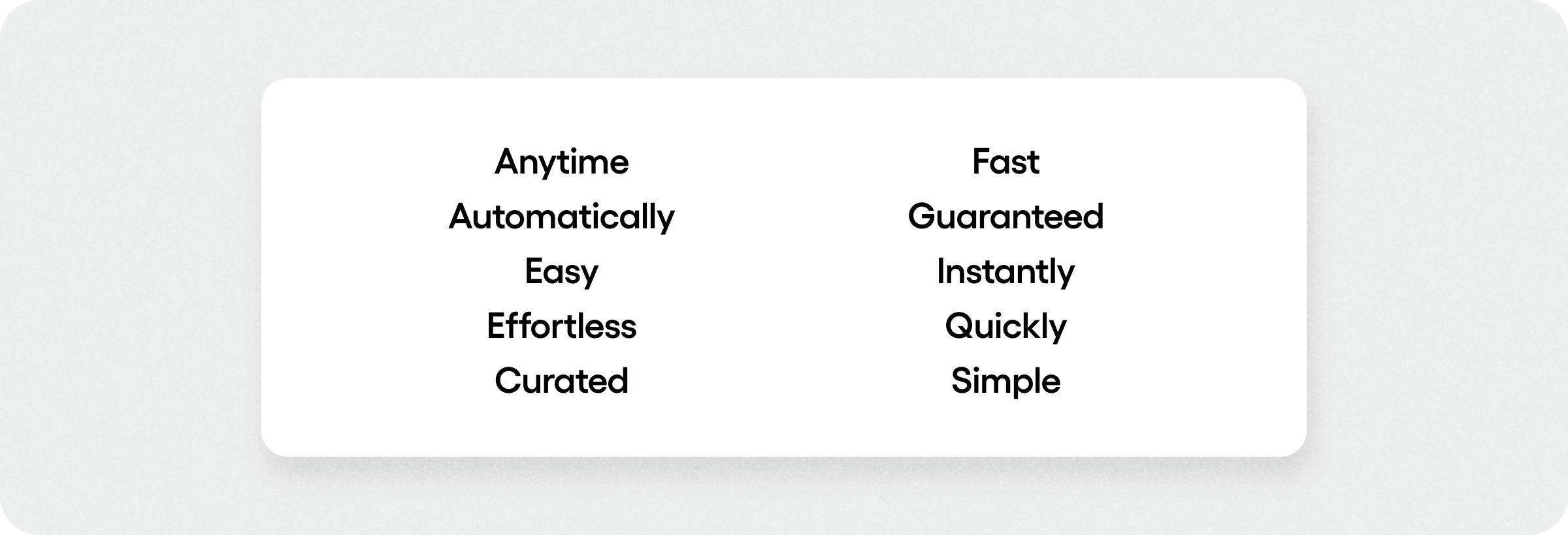
Promote ease and instant results
People want products that deliver immediate, easy, and painless solutions to their problems. Any unwanted delays or perceived effort in reaching a promised solution can reduce conversions.
This is especially important for subscription-based apps where users expect an immediate payoff after upgrading. “Get instant access to all features without delay when you sign up!”
You can experiment with power words like:
Drive action with urgency and scarcity
Adding a sense of urgency to UX copy can light a fire that gets users to act now instead of later (which often means never). For example, saying “Sale only lasts 24 hours!" tempts your audience to act because of the deadline.
Additionally, by invoking the idea of scarcity—or limited availability—users will be more inclined to act because they’ll miss out. Simply, the fear of loss is a powerful motivator, so it works well in time-sensitive marketing messages.
Power words for urgency and scarcity include:

Ignite interest with emotive messaging
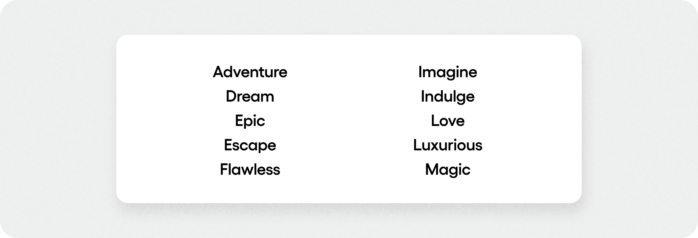
Since people buy with their hearts and justify it later with their heads, striking an emotional chord with users is a surefire way to boost conversions. Emotive language also makes your UX more fun and engaging.
“Escape the ordinary with an exotic getaway on a sun soaked beach. Rediscover the joy of travel—book now!”
You can try these emotive power words:
5. The best UX copy for retention
Building trust and deepening relationships is arguably the best way to turn users into loyal fans. 9 in 10 users who engage with an app as little as once a week are likely to retain that app, so here’s how the right UX copy can help boost retention and loyalty:
Promote a sense of exclusivity
Exclusivity language helps to reinforce users' sense of loyalty by appealing to their ego. Try using a personal touch as you remind users of the unique benefits of habitual use. For instance: “Thank you for one amazing year [Name]! Want to hear about the exclusive rewards for our most-valued members?”
By making users feel special and part of an exclusive group, you’re giving them more reasons to stay engaged, join your loyalty program, or share your app with friends and family.
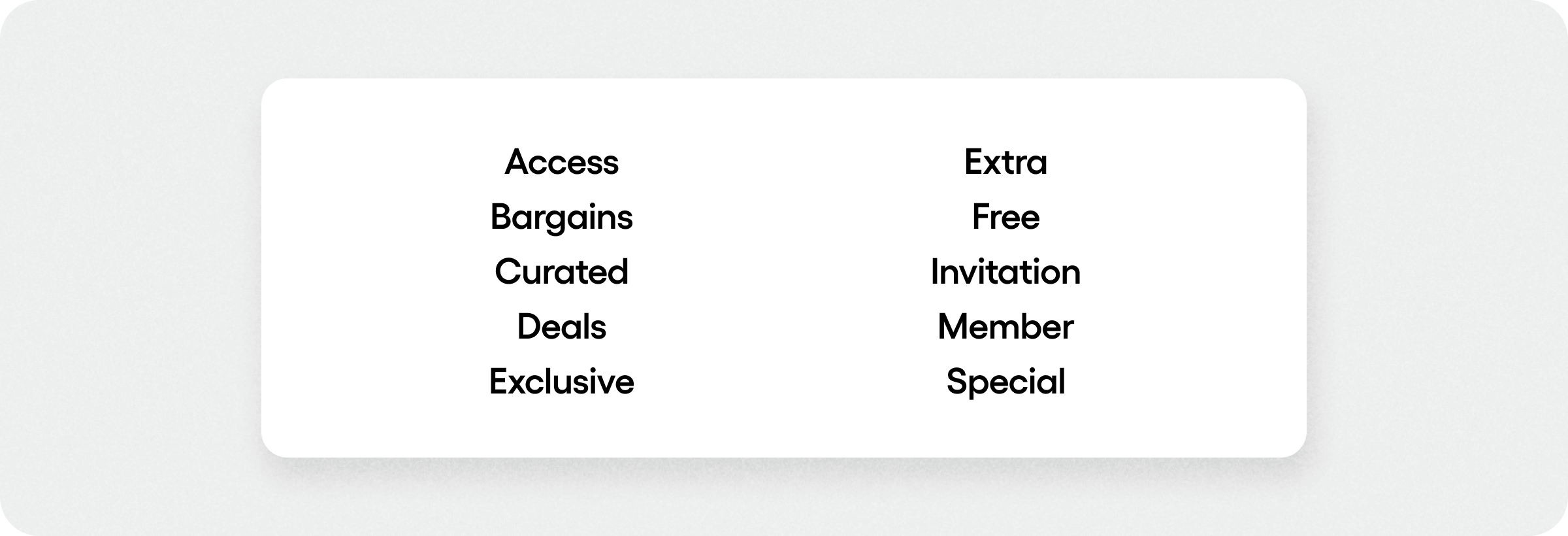
Try these power words to boost retention:
Best practices for writing your best UX copy
Boring UX copy has been the death of many apps—but power words can save you from this fate. From microcopy to in-app notifications to push notifications, here’s a handful of best practices to guide you as you craft your UX copy.
1. Keep it short
UX copy should be concise, punchy, and readable at a glance. The best-performing push notifications have 25 or fewer characters, and in-app messages are best kept to 10 words or less.
2. Prioritize user needs
Frame your UX copy in terms of what matters to the user: benefits and solutions. For instance, feature microcopy could say “Track your progress easily” instead of “Our system collects your data.”
3. Be conversational
A friendly, human tone is more enjoyable and inviting to read, so write UX copy as if speaking to a familiar acquaintance. For example, try “Oops! Looks like something went wrong” instead of “An error has occurred.”
4. Personalize your UX copy
Besides helping users feel appreciated and special, 98% of app marketers report that personalization drives more engagement and revenue.
5. Be clear and consistent
Power words amp up your product copy, but don’t let flair get in the way of clear, consistent messaging. Consistency helps users get familiar with your app, so don’t switch from using “Sign up” to “Register” on a different screen.
6. Don’t overuse your power words
Modern audiences are well-versed in marketing speak. If you use power words in places they don’t belong, your users will notice and it’ll come across as spammy and untrustworthy. It’s best to sprinkle them into UX copy so they stand out among typical words in the user interface.
14 proven strategies to boost your app engagement
Writing the best UX copy and notifications for iOS and Android
While power words aren’t magic per se, they can be pivotal to driving app engagement, retention, and conversions. They help to arouse excitement, counter short attention spans, and generate maximum interest in your app at every step.
Whether you need to add a touch of personalization, exclusivity, or value—you can experiment with combining power words in your UX copy, in-app notifications, and push notifications to get the most from your messaging.
With audience segmentation for mobile app messaging, you also can deliver mobile in-app messages and UX copy that resonates with all users.
If you want to add capabilities for in-app notifications, push notifications, or in-app chat to your mobile app, Sendbird can help.
Our developer-friendly APIs for in-app communications won the Best Communications API Award for two years running. You can build for free, just contact sales or request an in-app messaging demo with any questions.


